
Data Visualisation is a project on the amount of energy our data uses to exist and our current habit of Data hoarding.
The project presents itself in two parts:
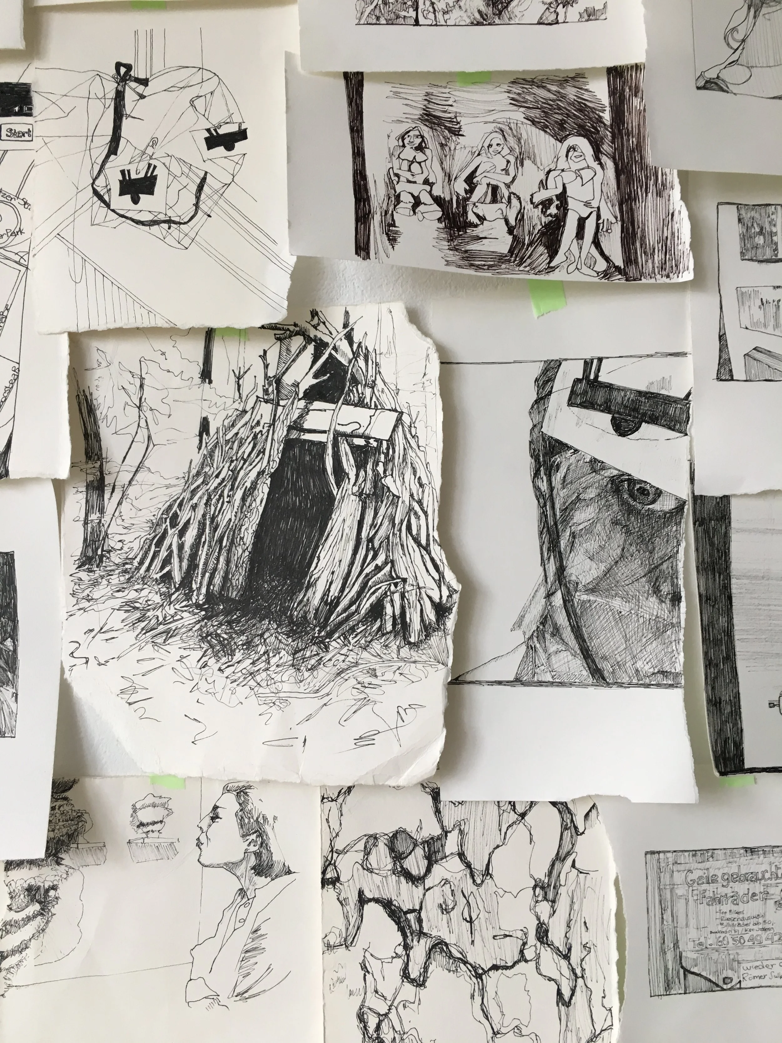
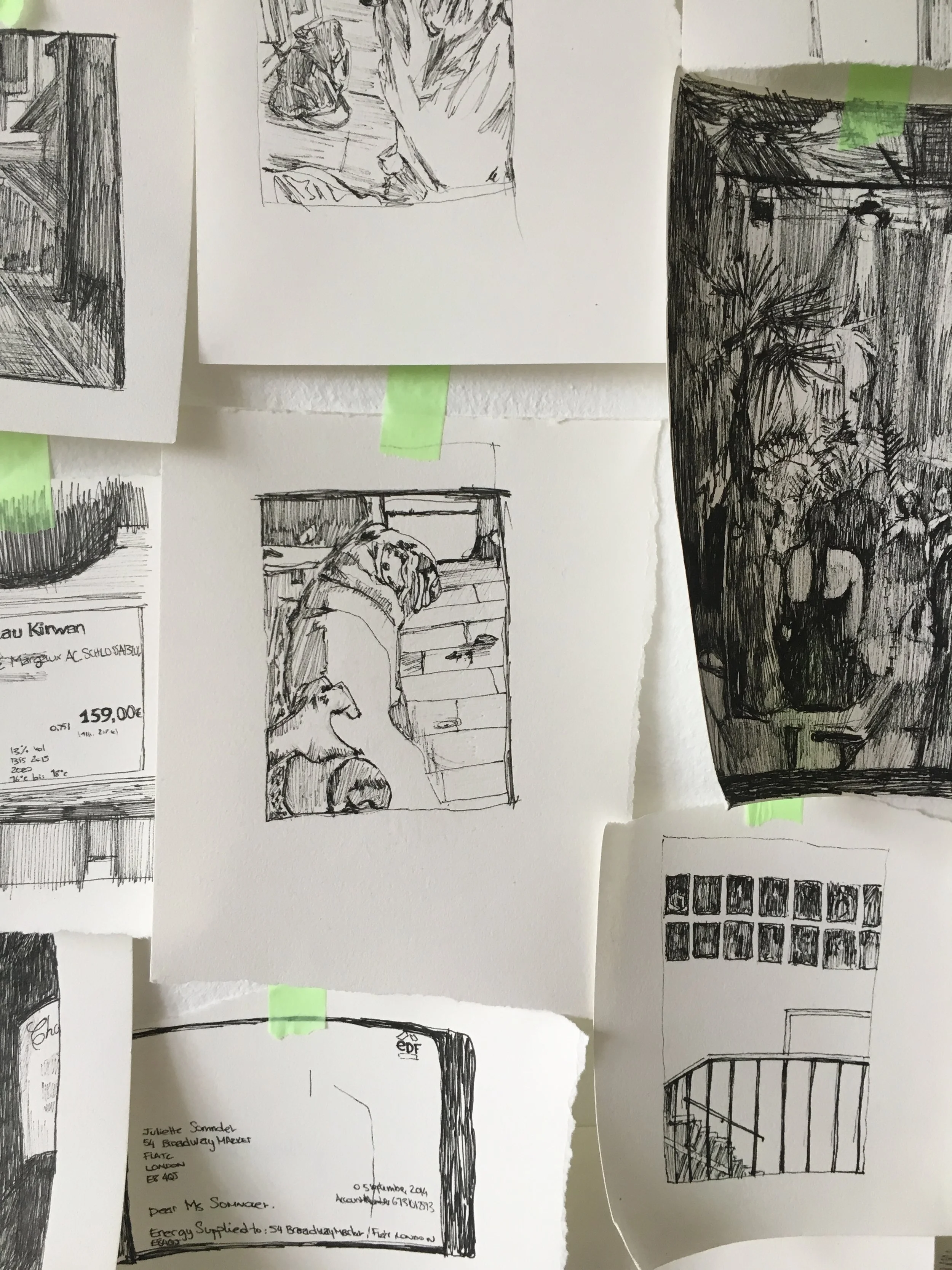
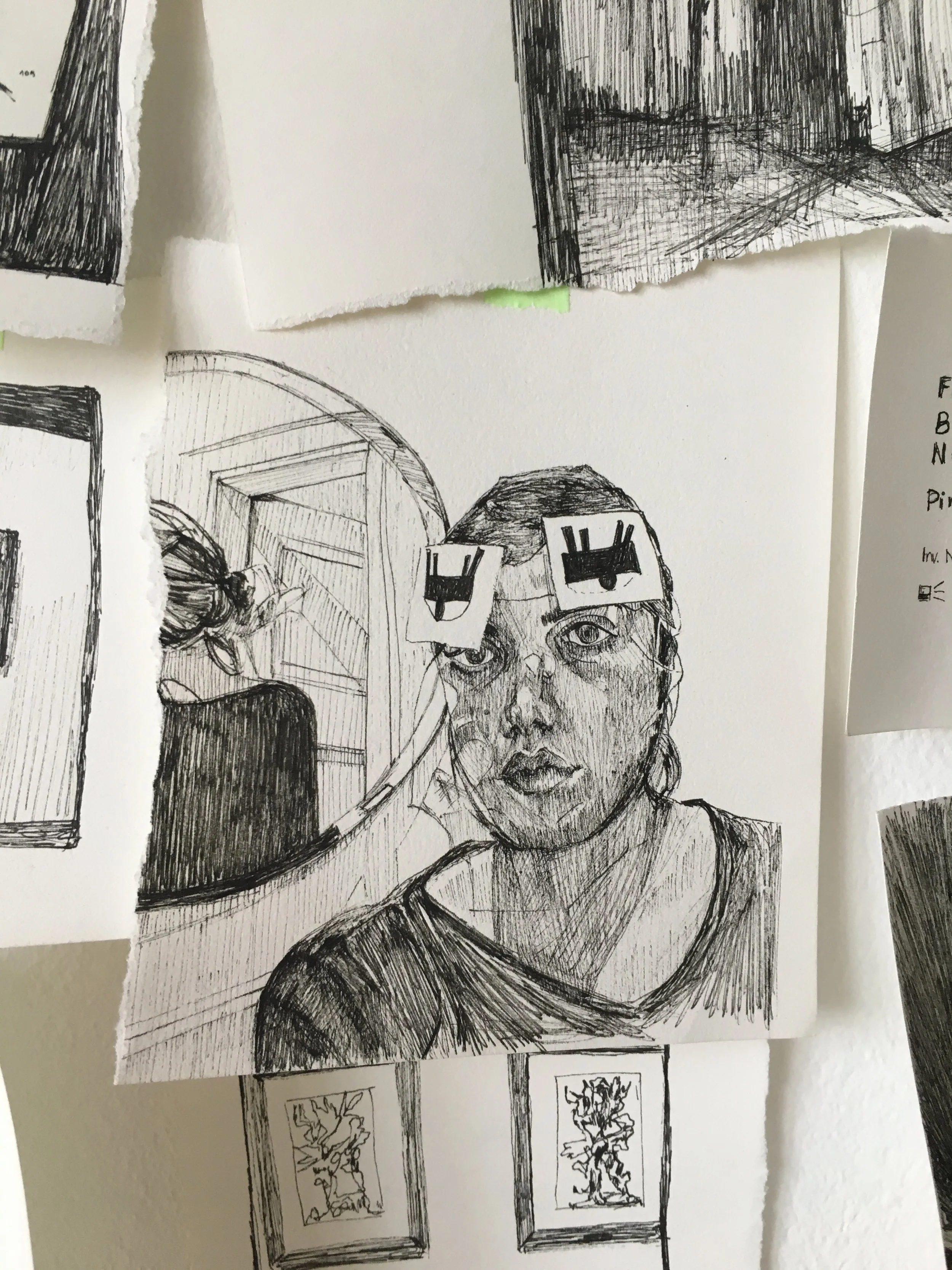
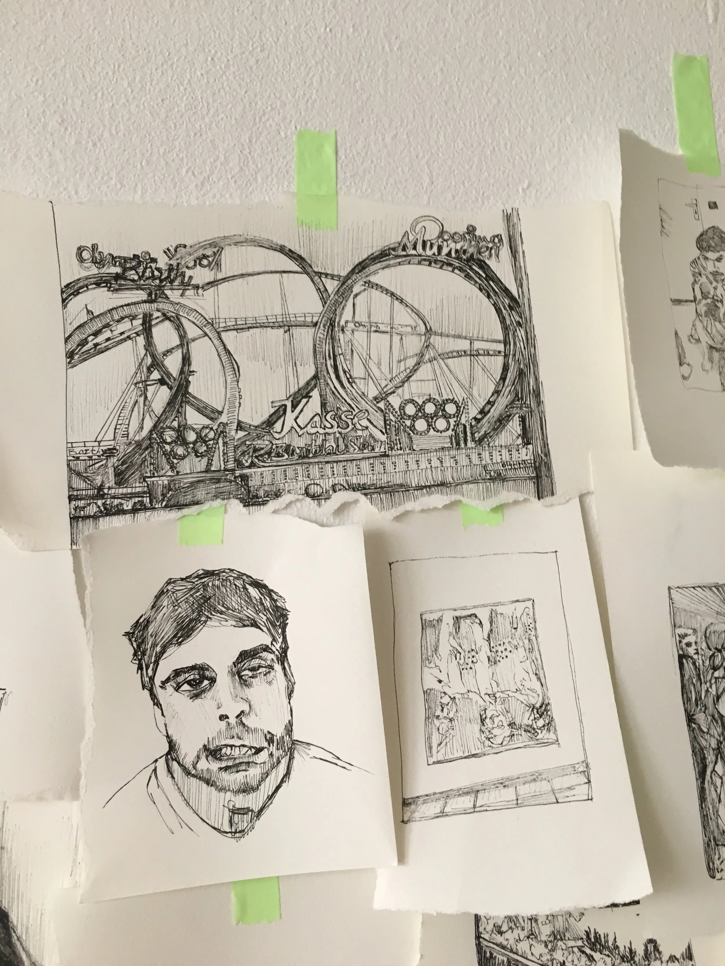
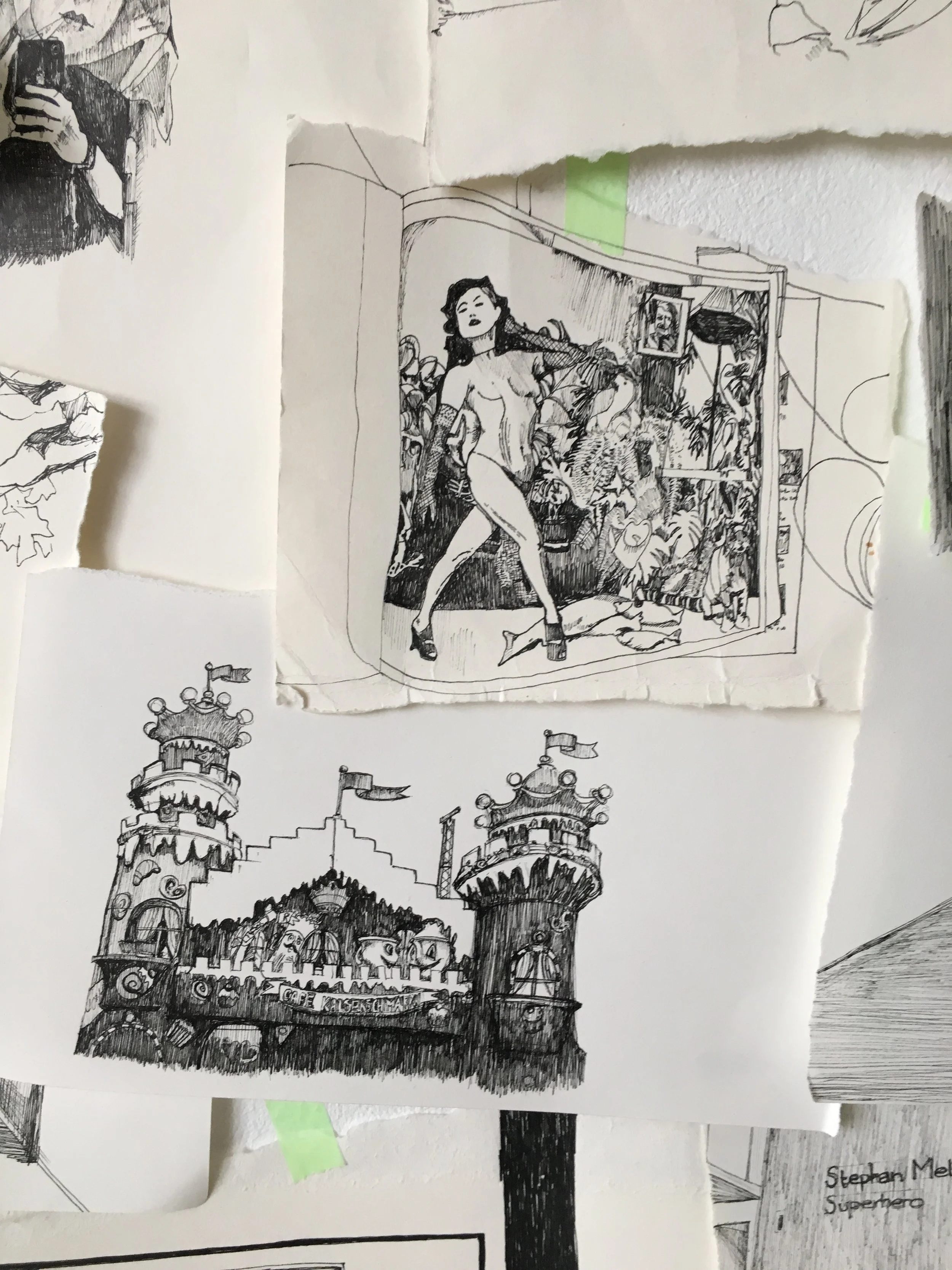
The first is a compilation of black and white ink drawings based on the photos in the artist’s phone between the 14th of September 2014 and 14th of October 2014. A total of 353 images which once put side by side on a wall will illustrate the mass of modern image hoarding. In this part of the project the viewer will recognise the series of photos taken and kept on an unknown dog, or series of images of a party, screenshots of bills and maps. This first part will also contain 278 other images from the same date that were kept on the Artist’s cloud, dropbox, emails and computer again treated in black and white ink.
The second part presents itself as an energy bill, after measuring the amount of electricity all Juliette’s online data needs to exist she has taken her own flat’s energy bill to compare both. Does her online Data equate her energy usage at home? As the servers that carry our information never sleep is the energy needed to power them equivalent to never turning the lights off in our houses?
Data Visualisation has the intention to push the viewer to question their relationship to Data and editing of their data footprint. We are at the beginning of this world of Data and it is up to the user to shape it’s future.
Work in progress.